
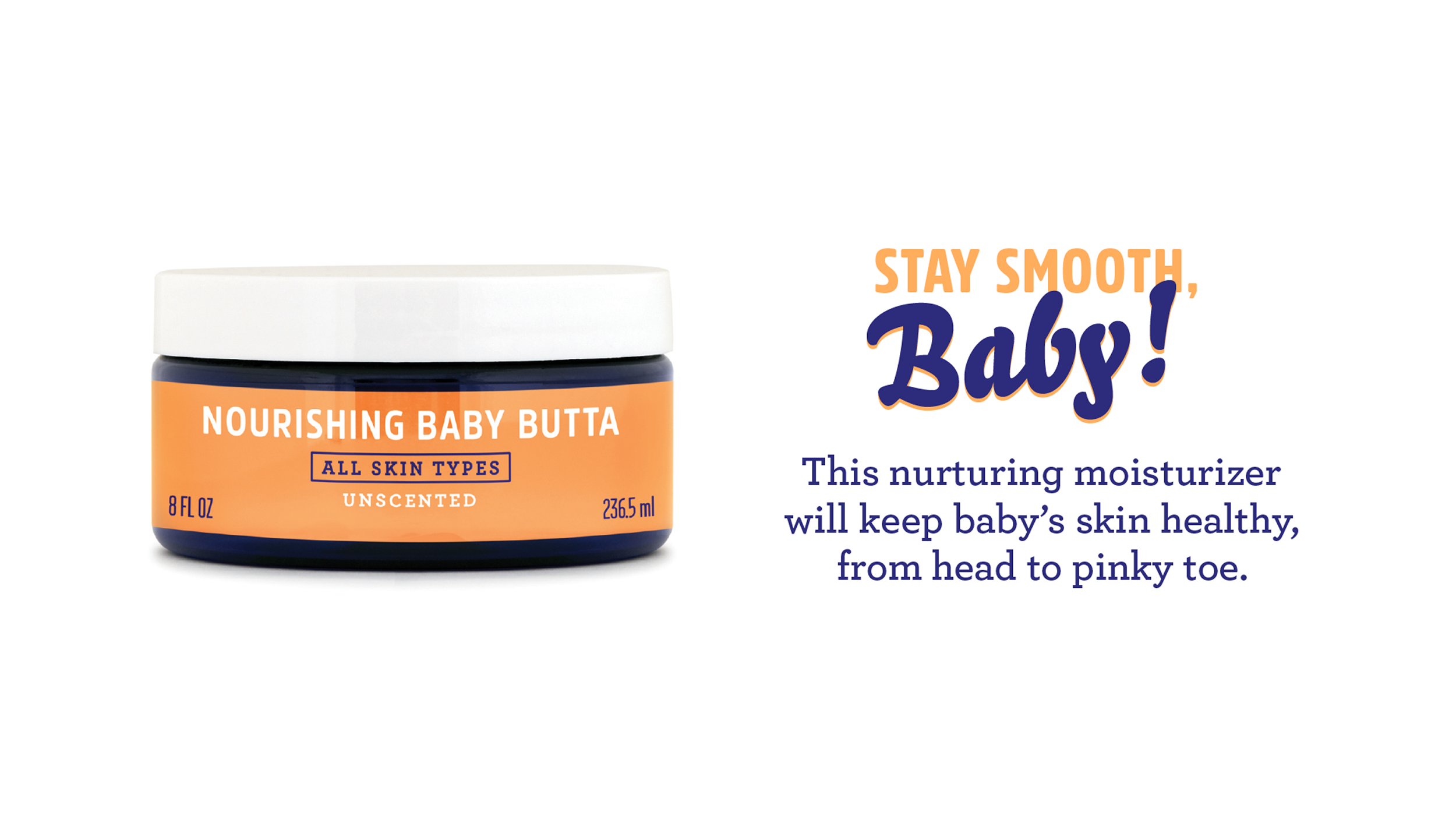
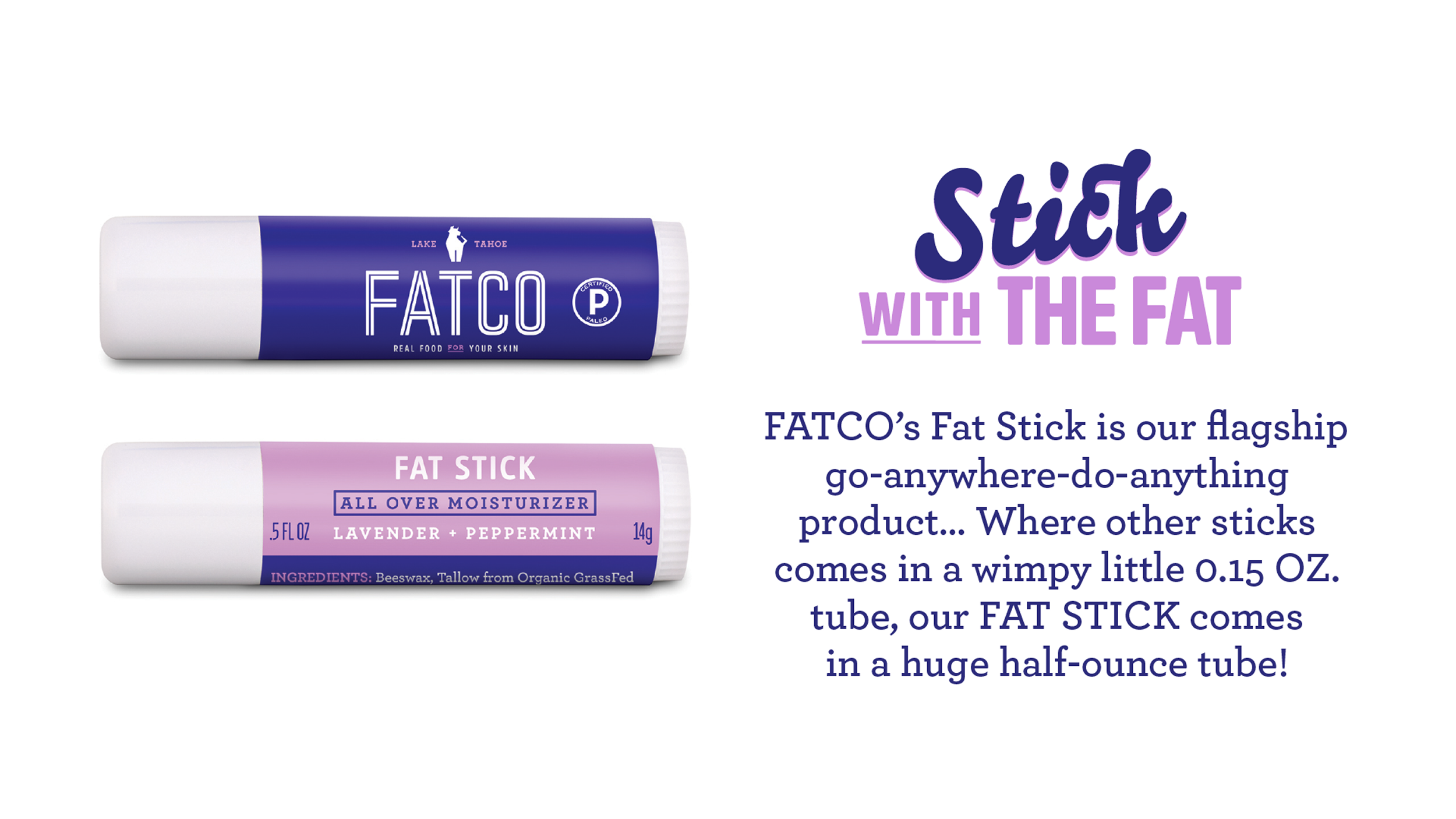
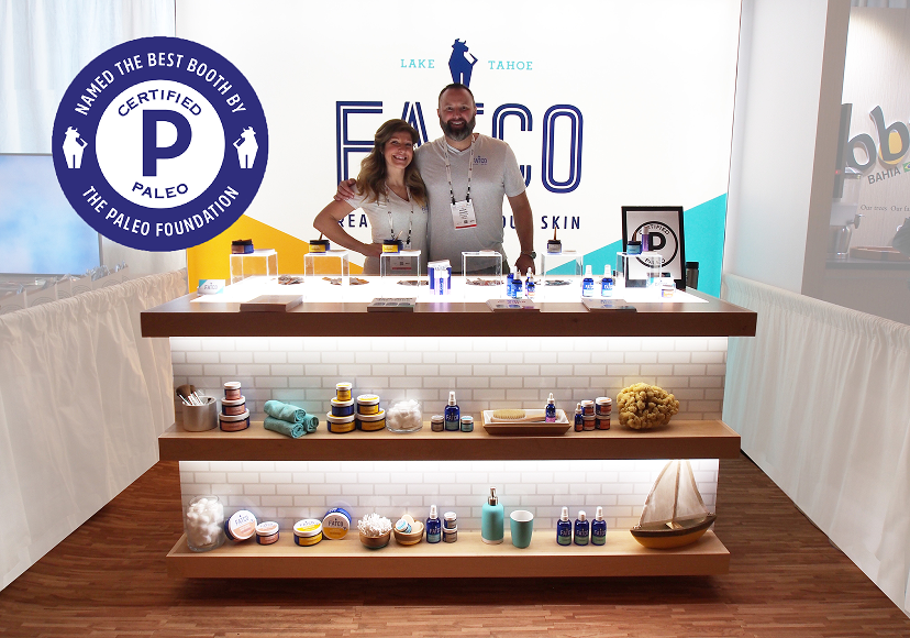
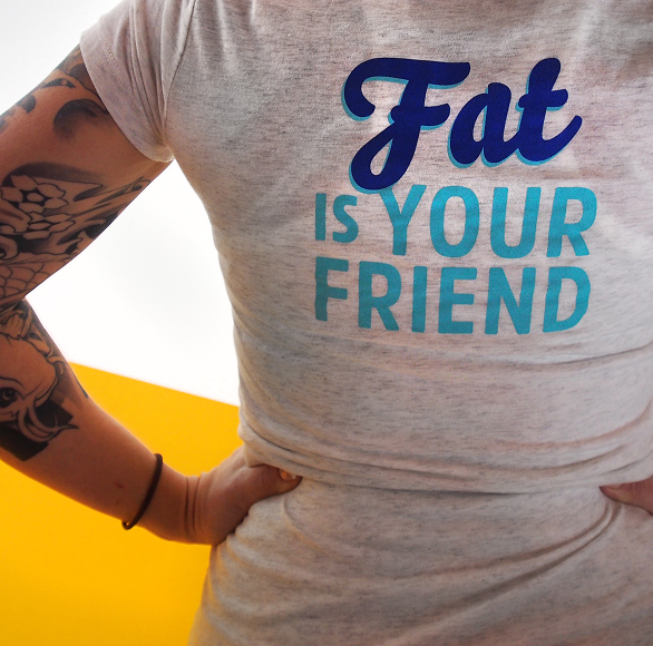
We didn’t just rebrand the name and packaging, we gave FATCO a voice that celebrates “fat is your friend”.
.png)

.png)
.png)
.png)



.png)
.png)


.png)
.png)
.png)
.png)
.png)


I have nothing but good things to say about my experience working with Shelf! Alison and her team were such a joy to work with!
The naming process was easy. The new name FATCO was short, succinct and memorable allowing it to be welcomed by retailers and easily adopted. Going from ‘Fatface Skincare’ to ‘FATCO’ didn't pigeonhole us into the skincare category, but rather allowed us to grow into other areas.
A complete brand kit is a highly valuable asset, and I believe it added a tremendous amount of value to the company sale in 2024. The branding made my job as a self-sustaining business owner easier to manage the brand without staff. And the brand look and feel, and everything that came with it, was a huge reason our buyer moved forward with acquiring FATCO.
Throughout our 10 years in business from launch to sale, we received nothing but positive feedback about the brand name, the colors, and the overall brand look and feel.
Cassy Burnvoth,
CEO & Founder FATCO
Our Mission
We create brands that people love, because without that special feeling of surprise and delight, a product is just a product.
Based in Austin, TX
Searching for the perfect name?
Visit our sister site, shelfnaming.com. Naming is our specialty.


.png)

