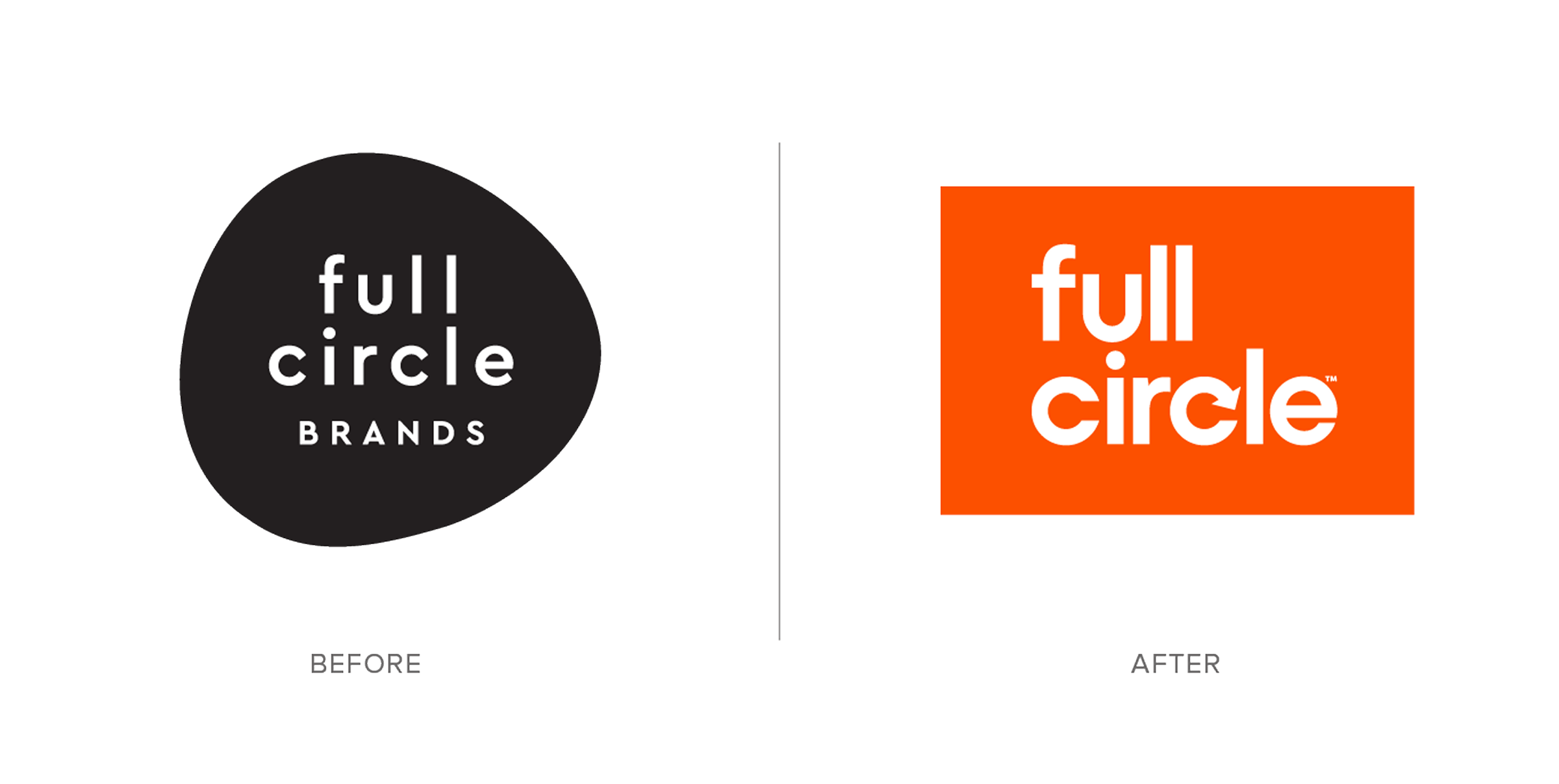
Full Circle Home (often referred to as "Full Circle") arrived with a solid foundation: an eco-friendly catalog of home goods made from sustainable materials like bamboo and recycled plastics. The brand had a great story and product line, but their visual identity felt fragmented. Their original logo featured a house icon, and their packaging palette used a strong red-orange tone. The brand needed to evolve its look to better reflect its purpose and create a clearer hierarchy across its growing product lines. Time for the packaging to catch up with the mission.
The core issue was shelf presence and readability. The bold orange palette and small type made it hard for products to stand out as a unified brand story, and the lack of hierarchy and visual clarity weakened the message. Our task was to redesign the packaging identity to create cohesion, improve readability, and let Full Circle's personality shine through.
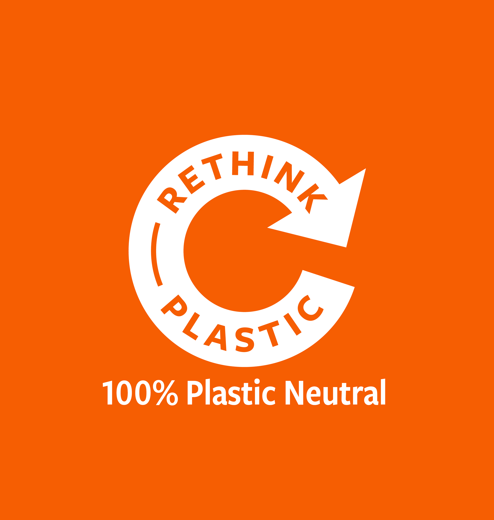
- Create an icon and pack structure that reflected what Full Circle truly represents — a “full circle” of materials, lifecycle, and purpose.
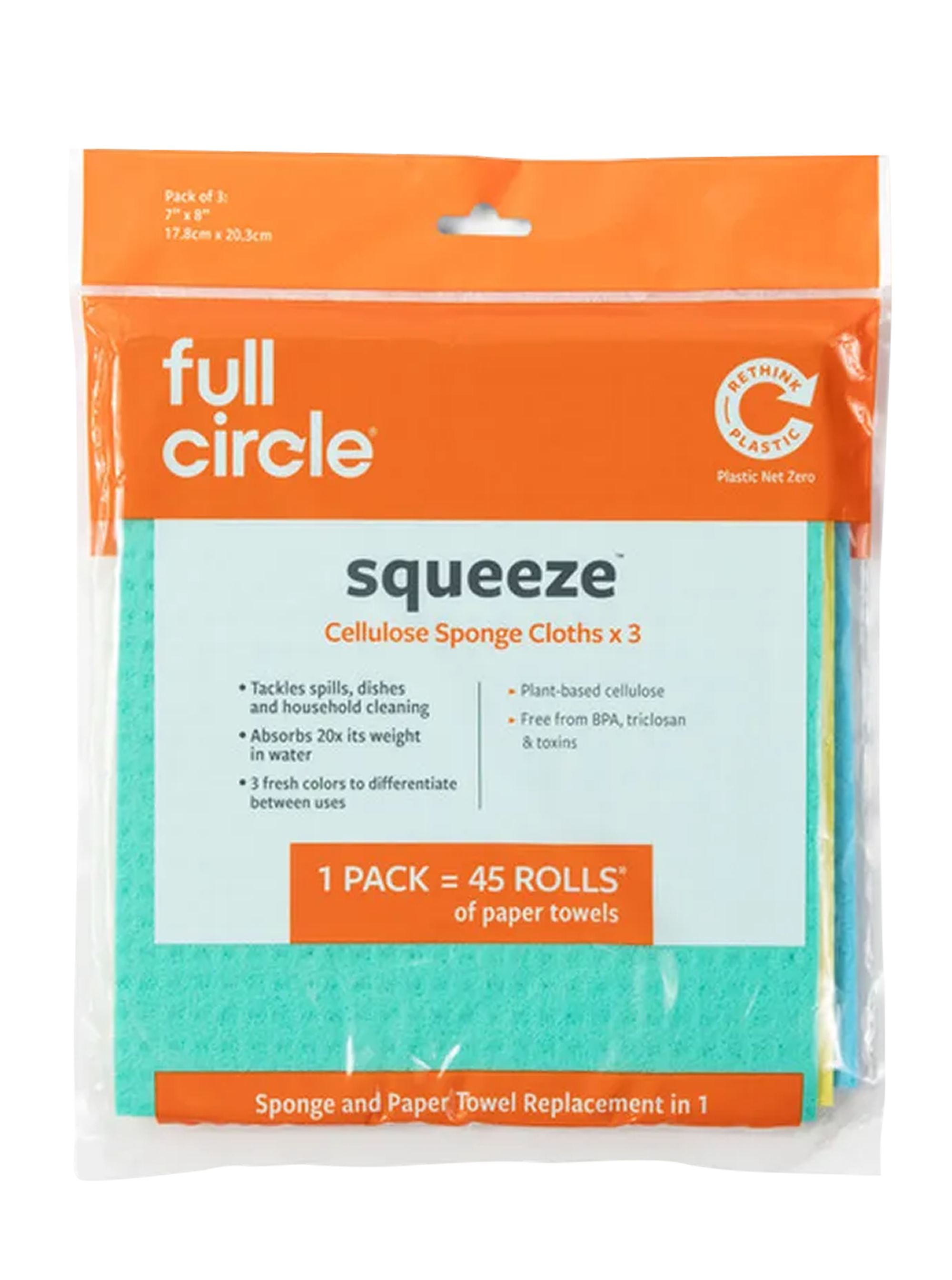
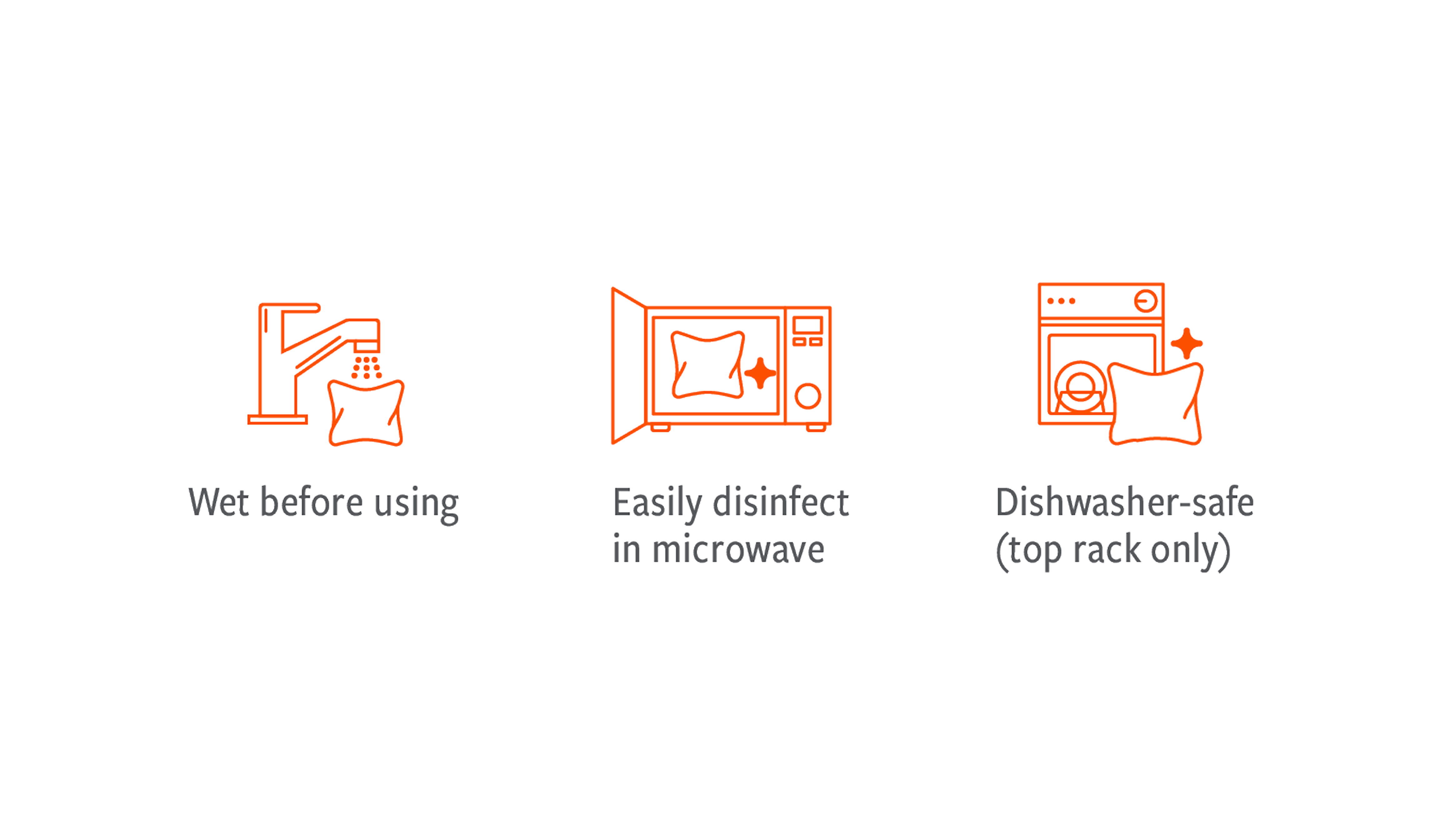
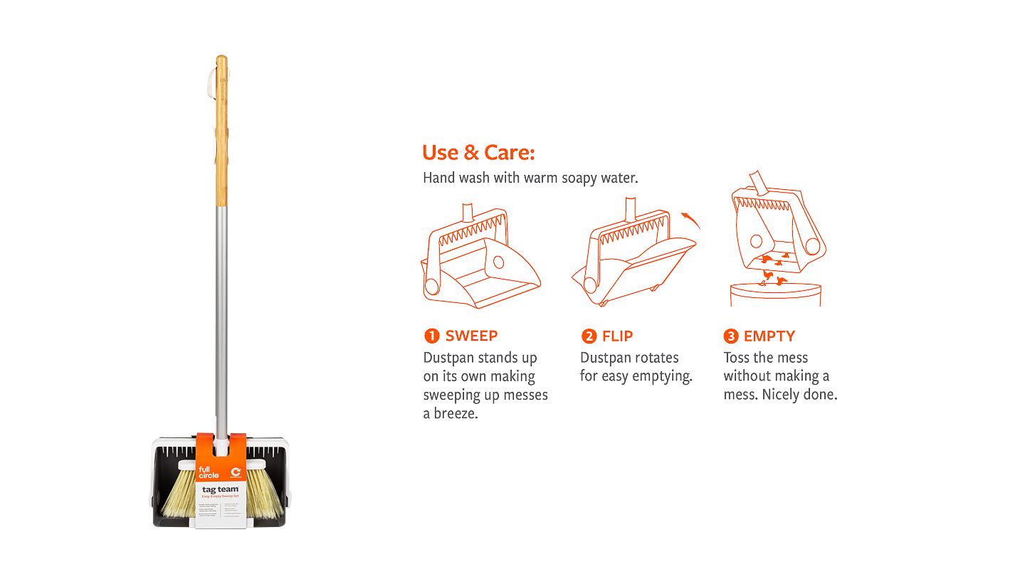
- Improve legibility of product benefits so consumers understand sustainability, performance, and functionality.
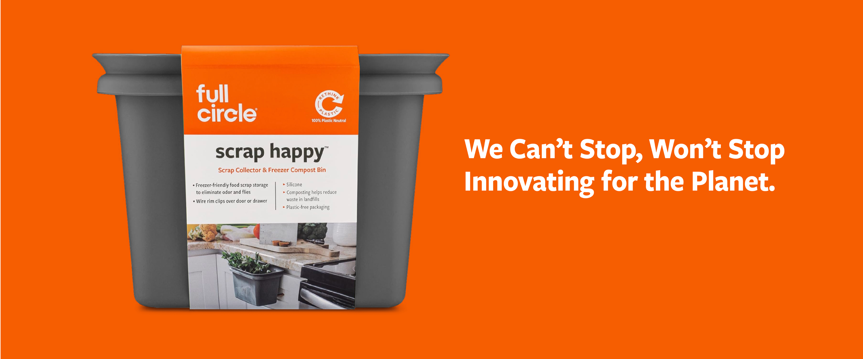
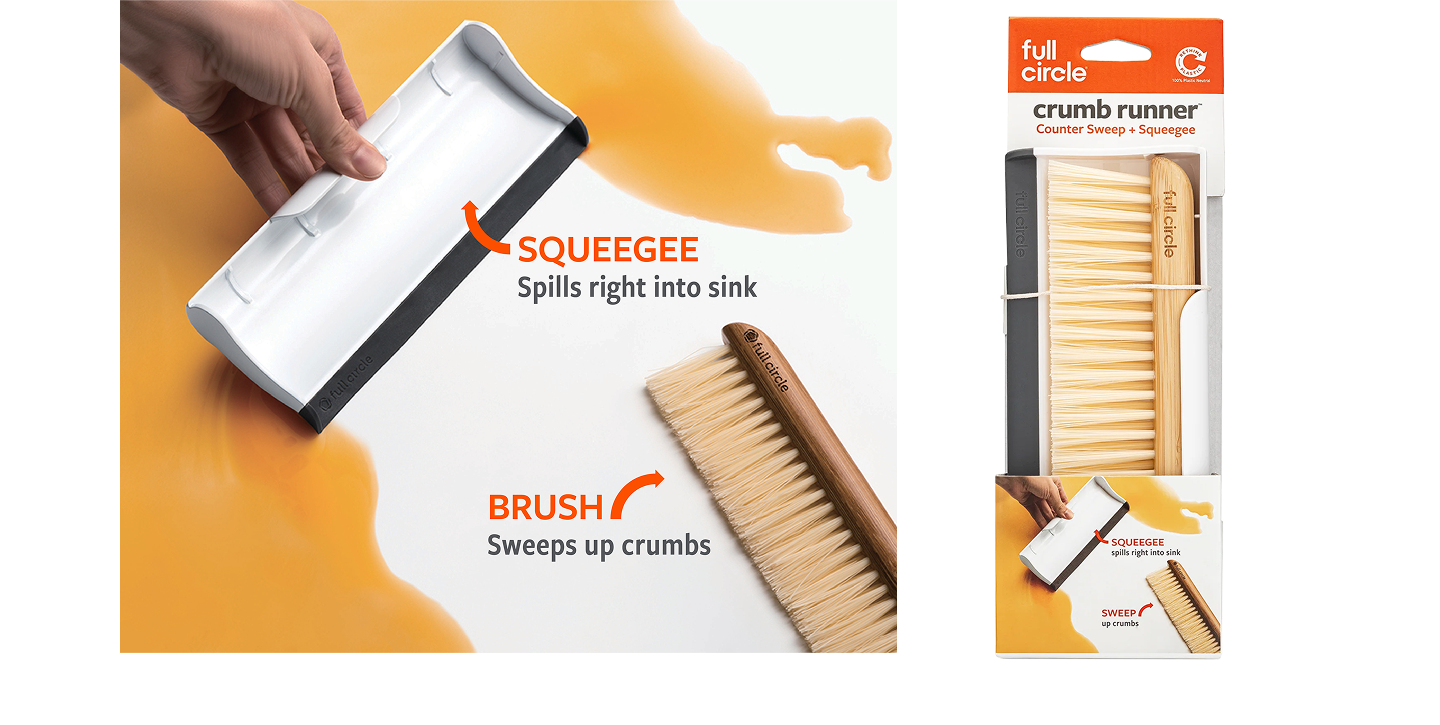
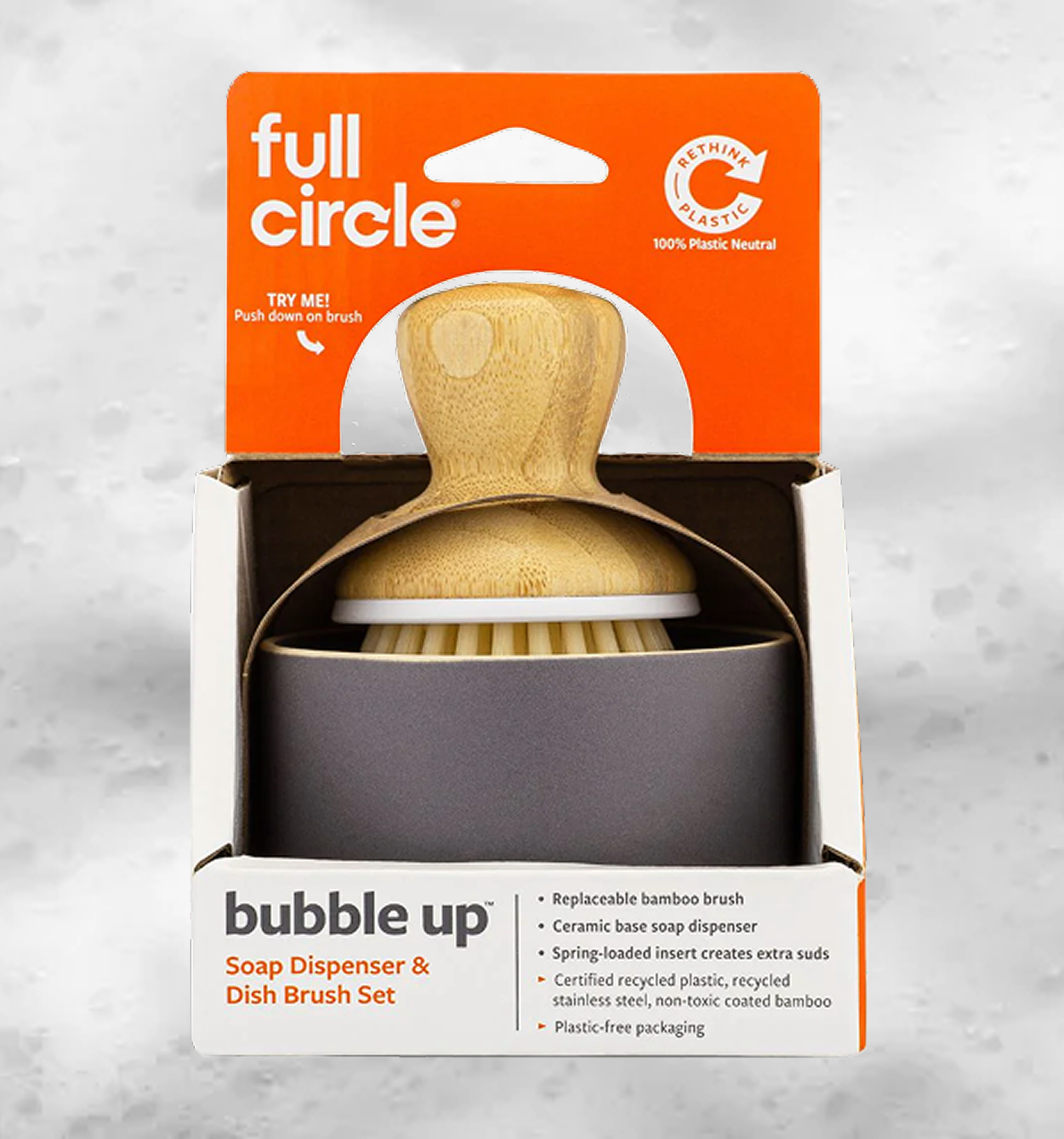
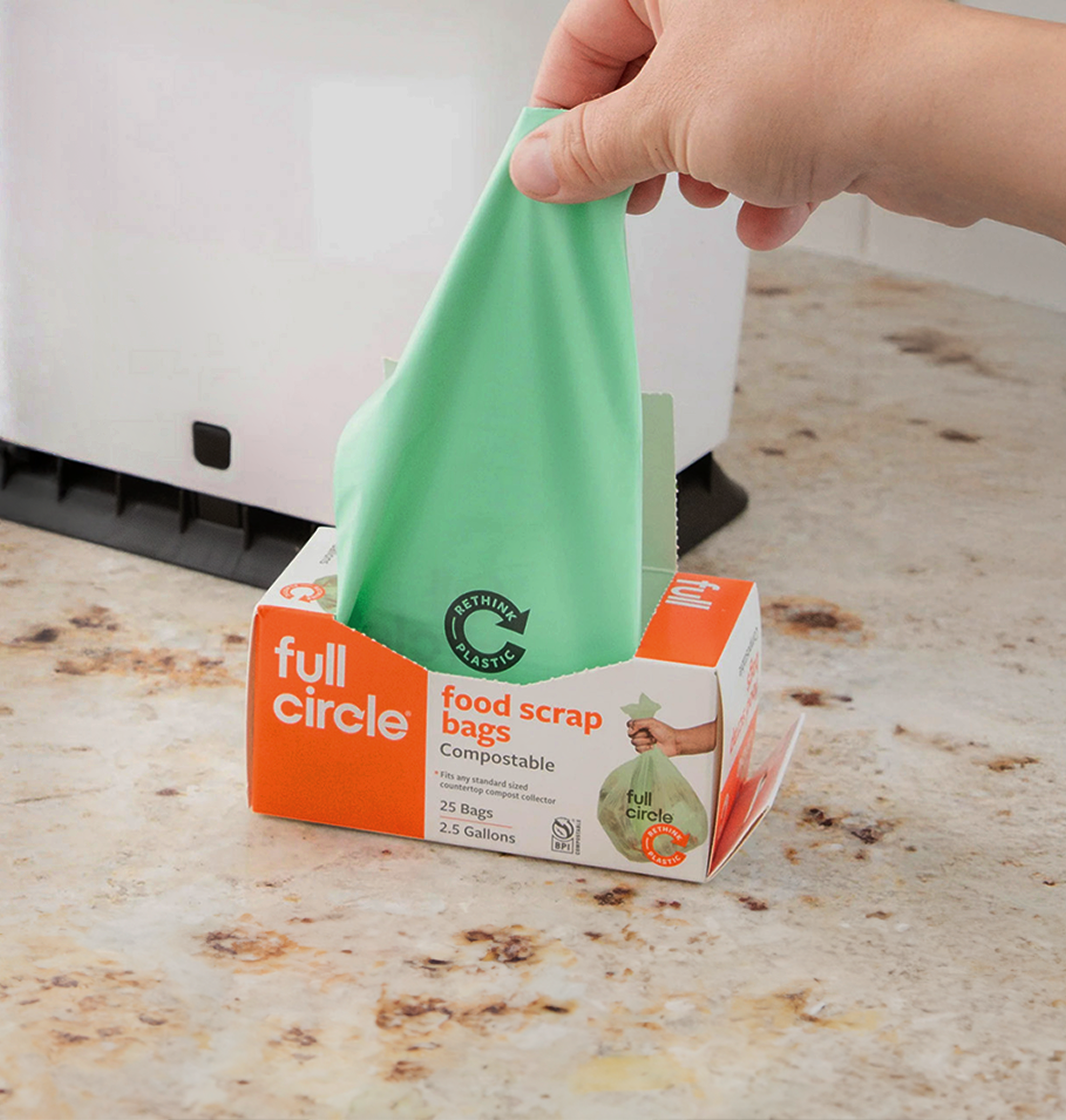
- Introduce a split-grid layout: one half white or translucent (so customers could see the product) and the other half orange or dark grey to communicate benefit, typography and branding.
- Create brand guidelines, messaging hierarchy and a work-able structure so that the brand could roll out internally after the first 15 products.
- Conduct consumer testing in online focus groups to select the strongest identity and pack design direction.
.png)
.png)
.png)


.png)

