Lady Bird Provisions began when founder Sarah showed up with her handcrafted "butter coffee bombs"—single-serve drops made from a full tablespoon of butter blended with functional ingredients. Already a hit at farmers markets, she was ready to take on retail. With non-GMO ingredients, no preservatives, and thoughtfully crafted blends, the brand promised to "drop function into beverages, one bomb at a time." Sarah had an early version of her packaging and a whimsical flying elephant logo named Lady Bird, but she needed a retail-ready brand that could match the quality and heart she'd poured into every bomb.
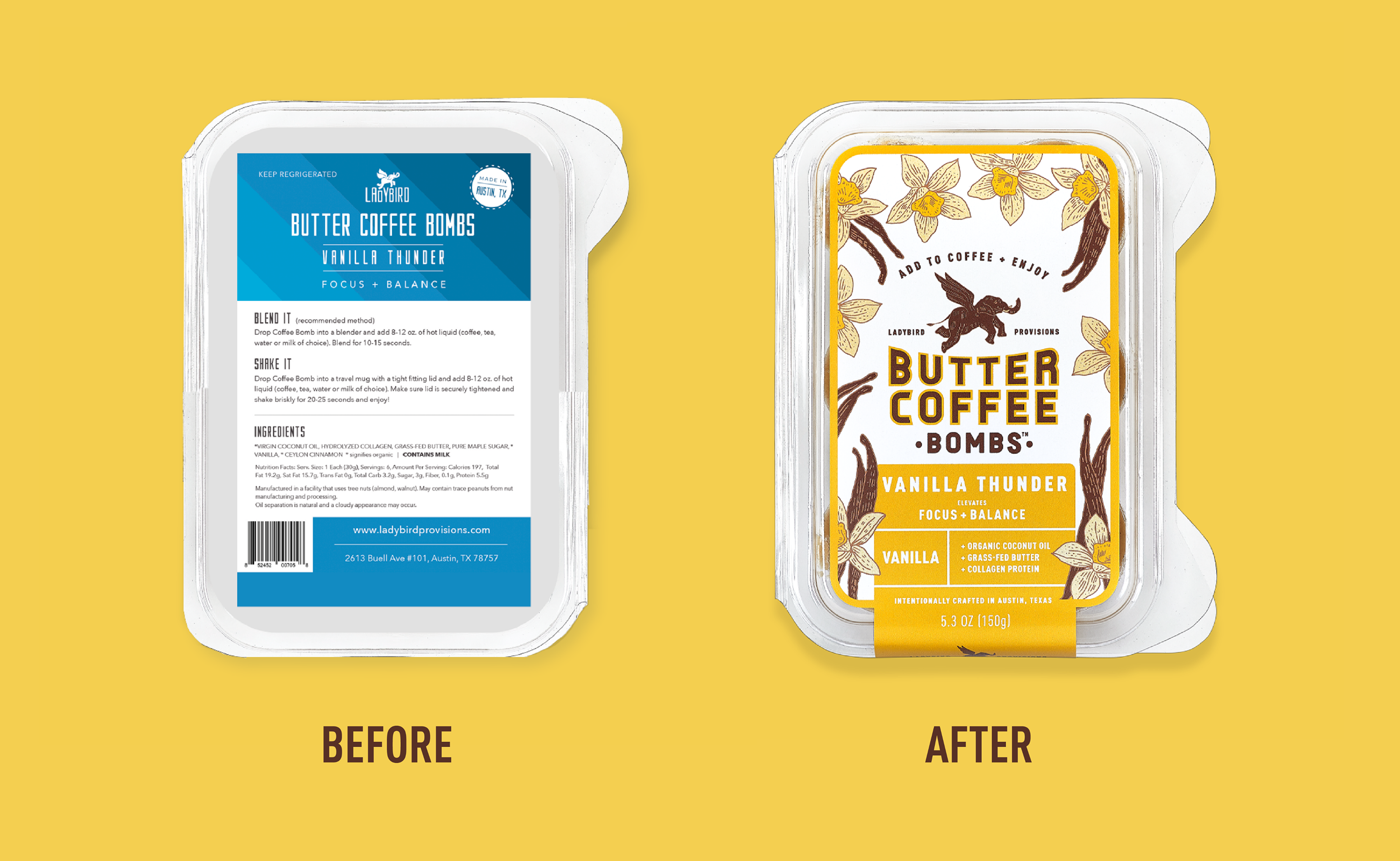
Lady Bird Provisions needed to evolve its packaging from a homemade feel into something that felt premium, organic, and trustworthy — while still preserving the charm of its flying-elephant logo and the founder’s nourishing, grounded personality.
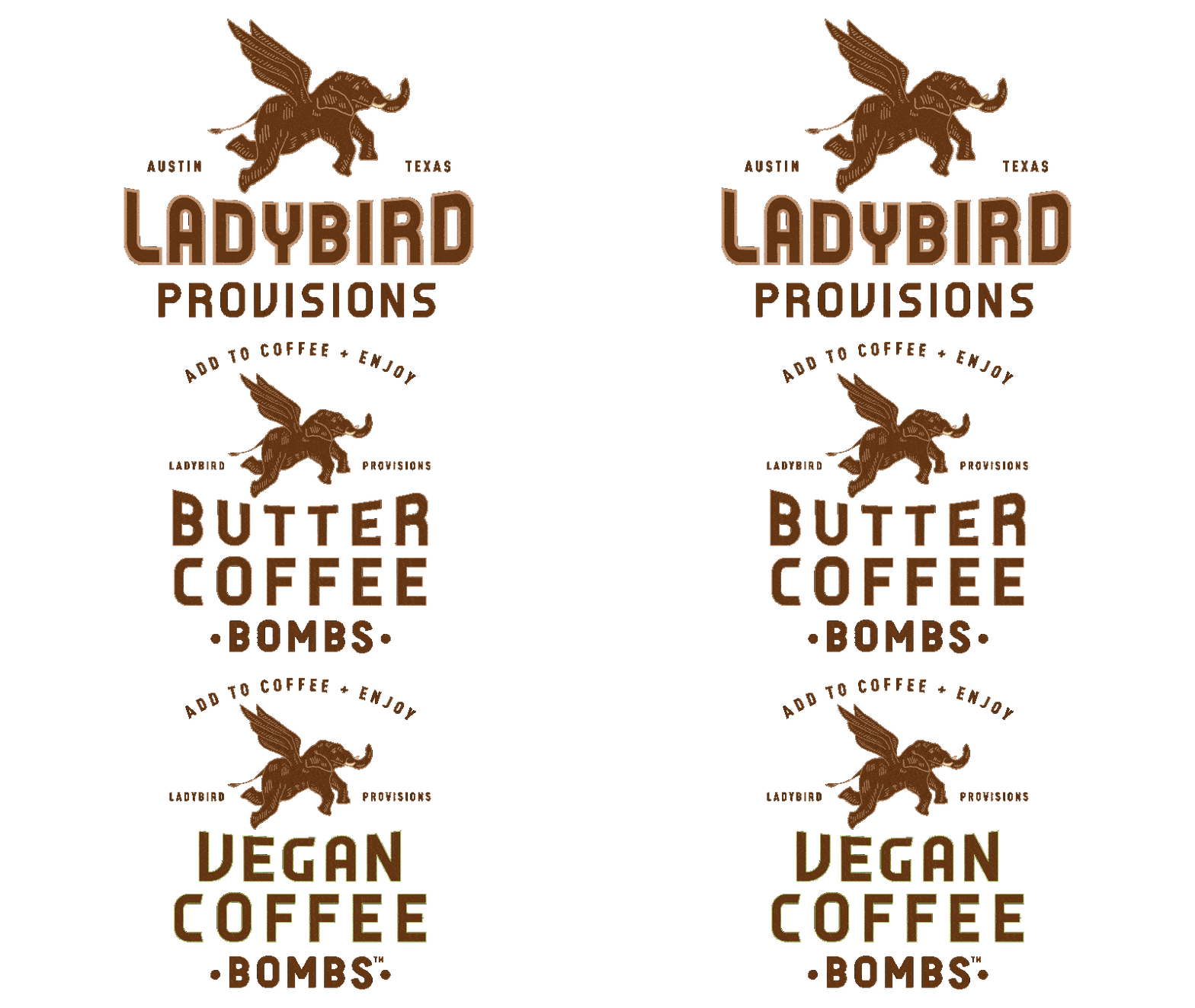
- Refine the beloved elephant logo to communicate strength, warmth, and credibility without losing its original character.
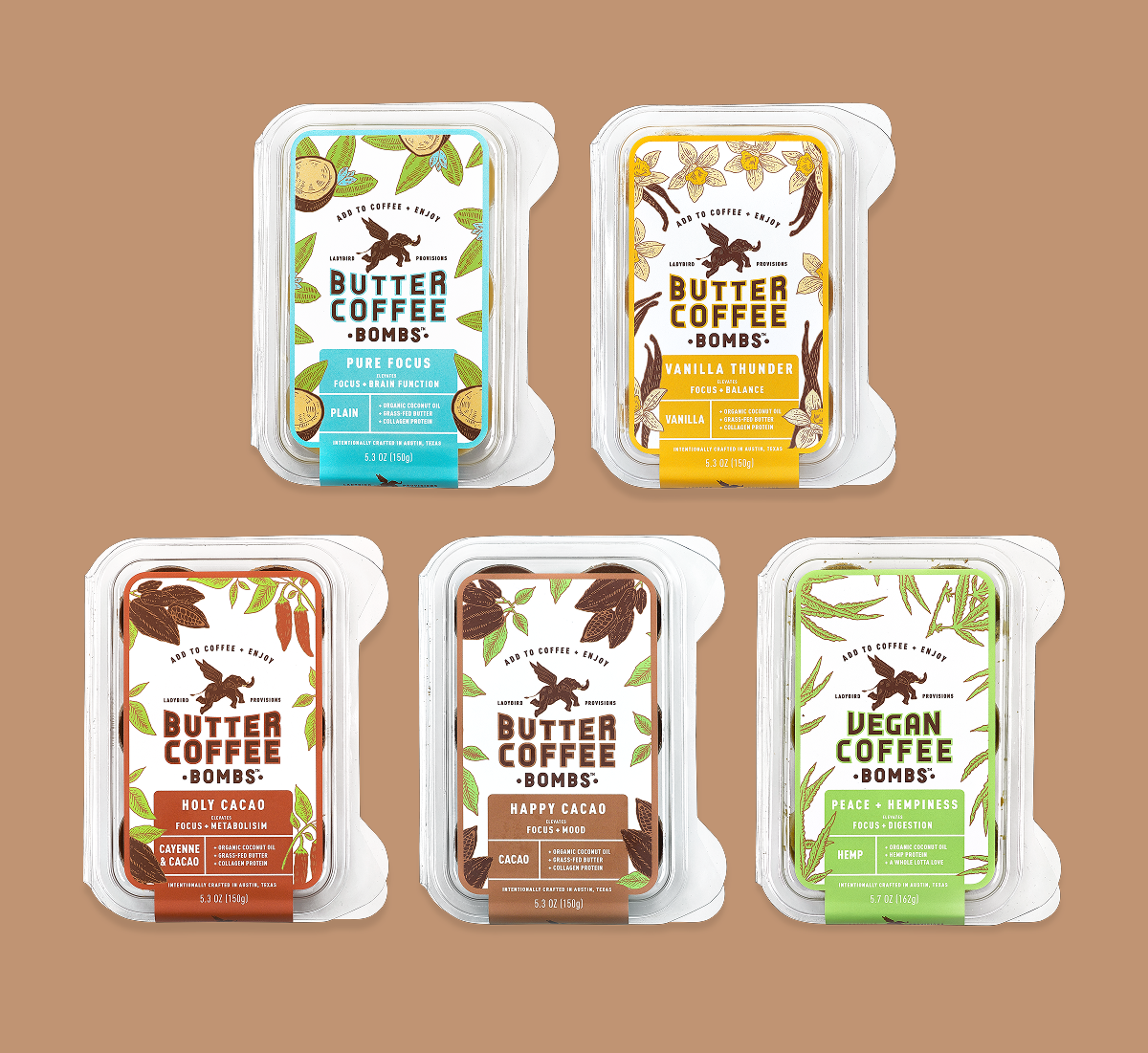
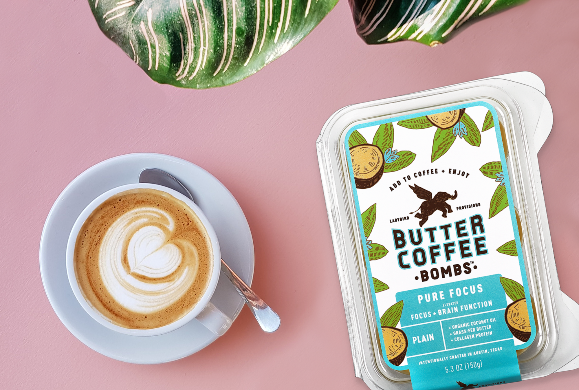
- Create custom botanical illustrations for each flavor (e.g., cacao, vanilla, coconut, hemp) to reflect the specific ingredients and reinforce simple, clean nutrition.
- Design flavor-specific packaging graphics that highlight the functional benefits of each variant, using bold typography and color-coded systems to educate customers and help them quickly identify their preferred nutritional profile.
- Maintain the brand’s core values of approachability, nourishment, and real-food benefits such as sustained energy and mental clarity.
.png)
.png)
.png)
.png)


.png)

