TigerMamas was born in Amy Tosi's kitchen when she and her son needed snacks that wouldn't betray their autoimmune conditions. Enter the tigernut: not actually a nut, but a tuber with a naturally sweet, earthy flavor that makes gluten-free cookies taste like an indulgence, not a compromise. Amy's philosophy? "No one should choose between safe and delicious." Turns out, you really can have both.
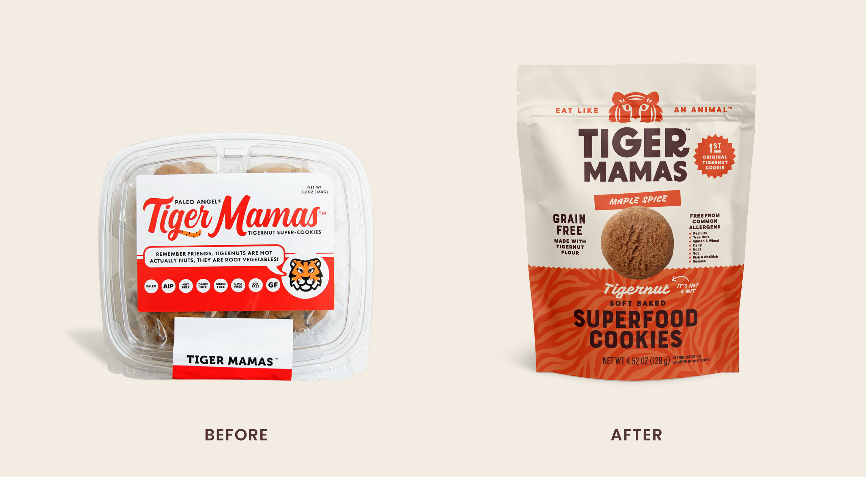
TigerMamas needed a brand identity as bold and fun as the cookies themselves. The task was to create packaging and messaging that could:
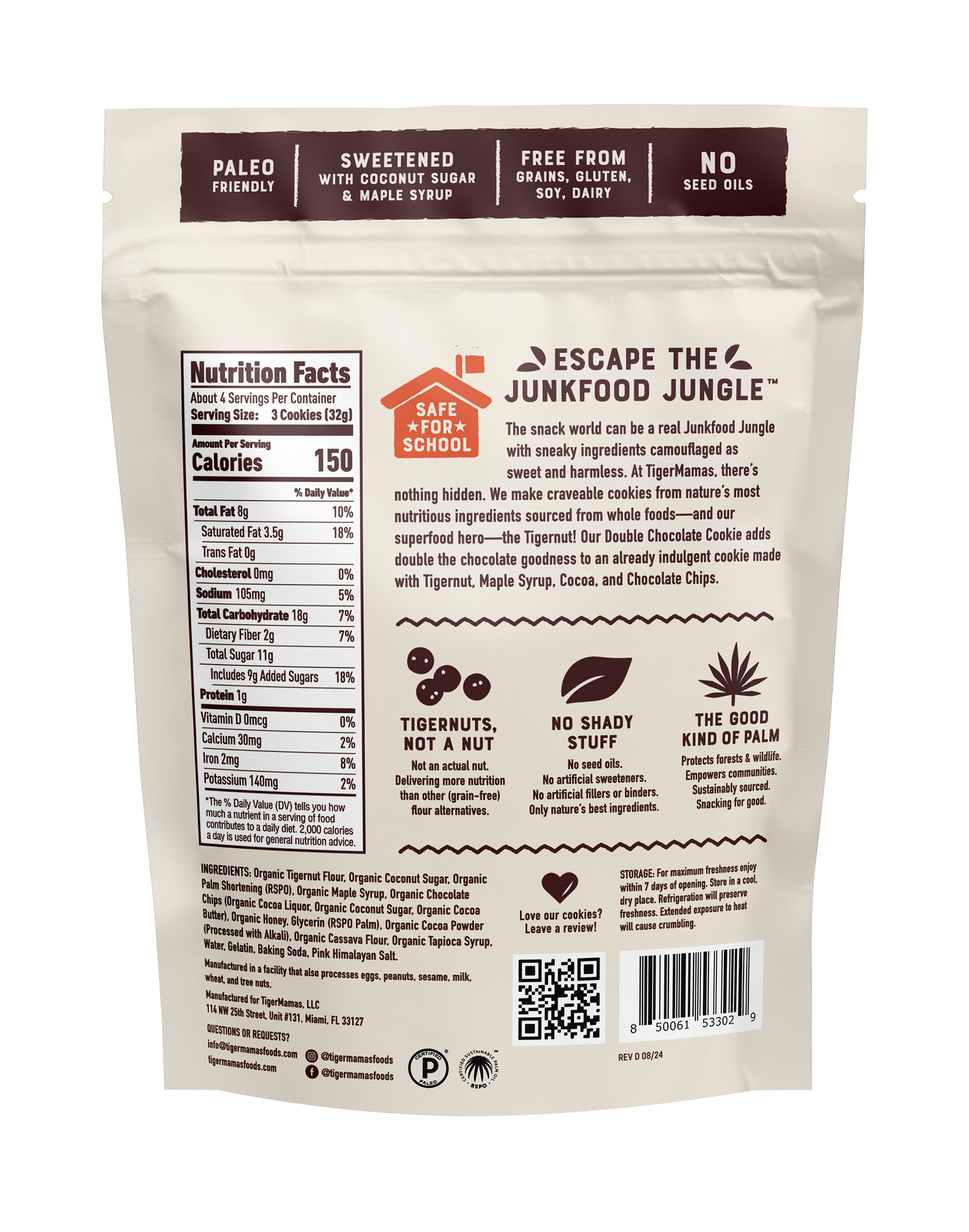
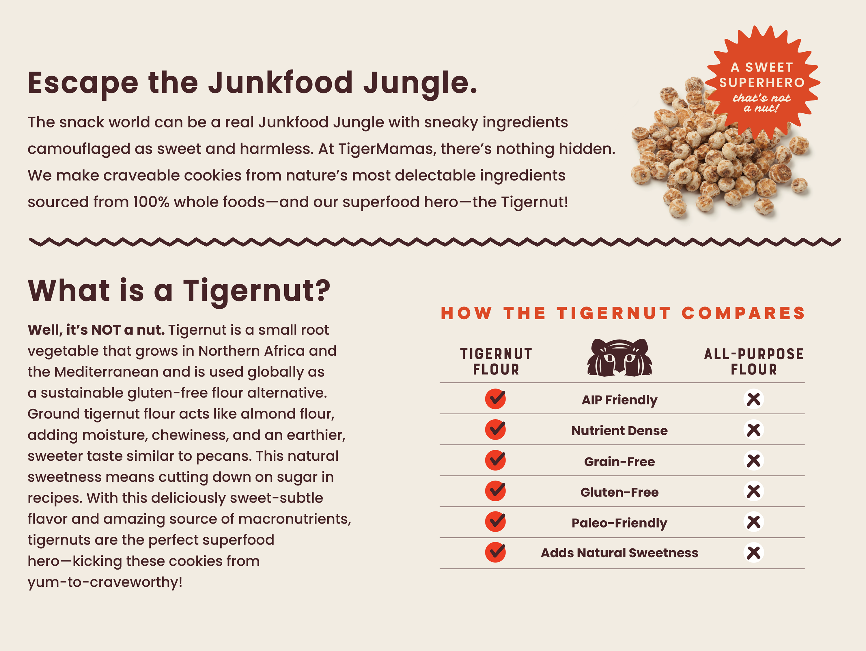
- Introduce the tigernut. Most people had never heard of it, so we needed to educate consumers on why this tuber (not a nut!) beats other grain-free alternatives.
- Own a bold positioning. "Escape the junk food jungle" and "Eat like an animal" captured the brand's playful tone and commitment to clean snacks, but it had to come through loud and clear.
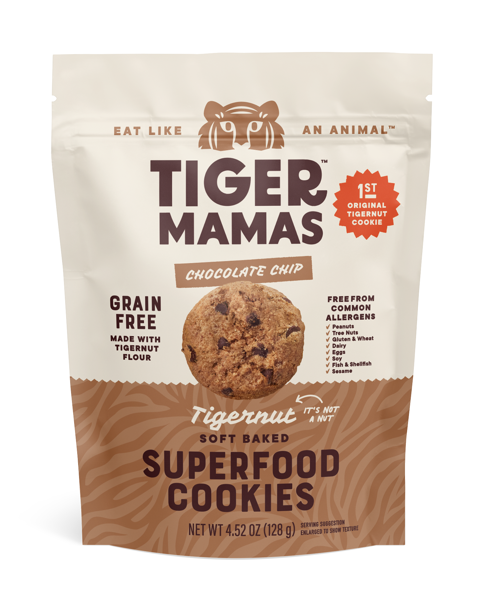
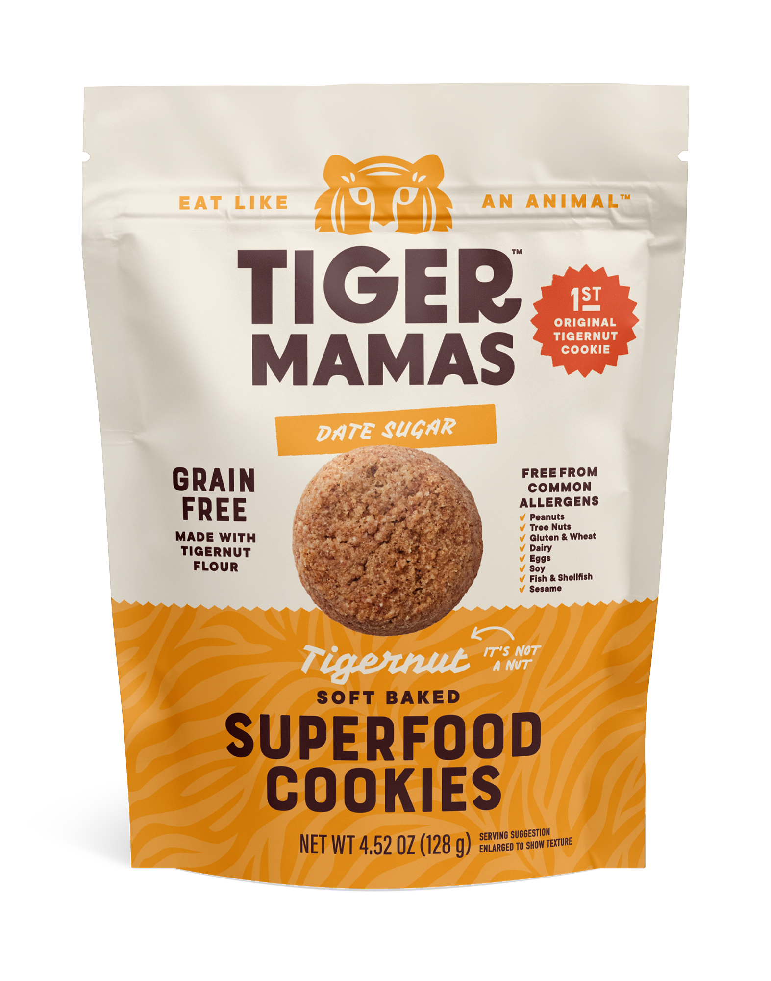
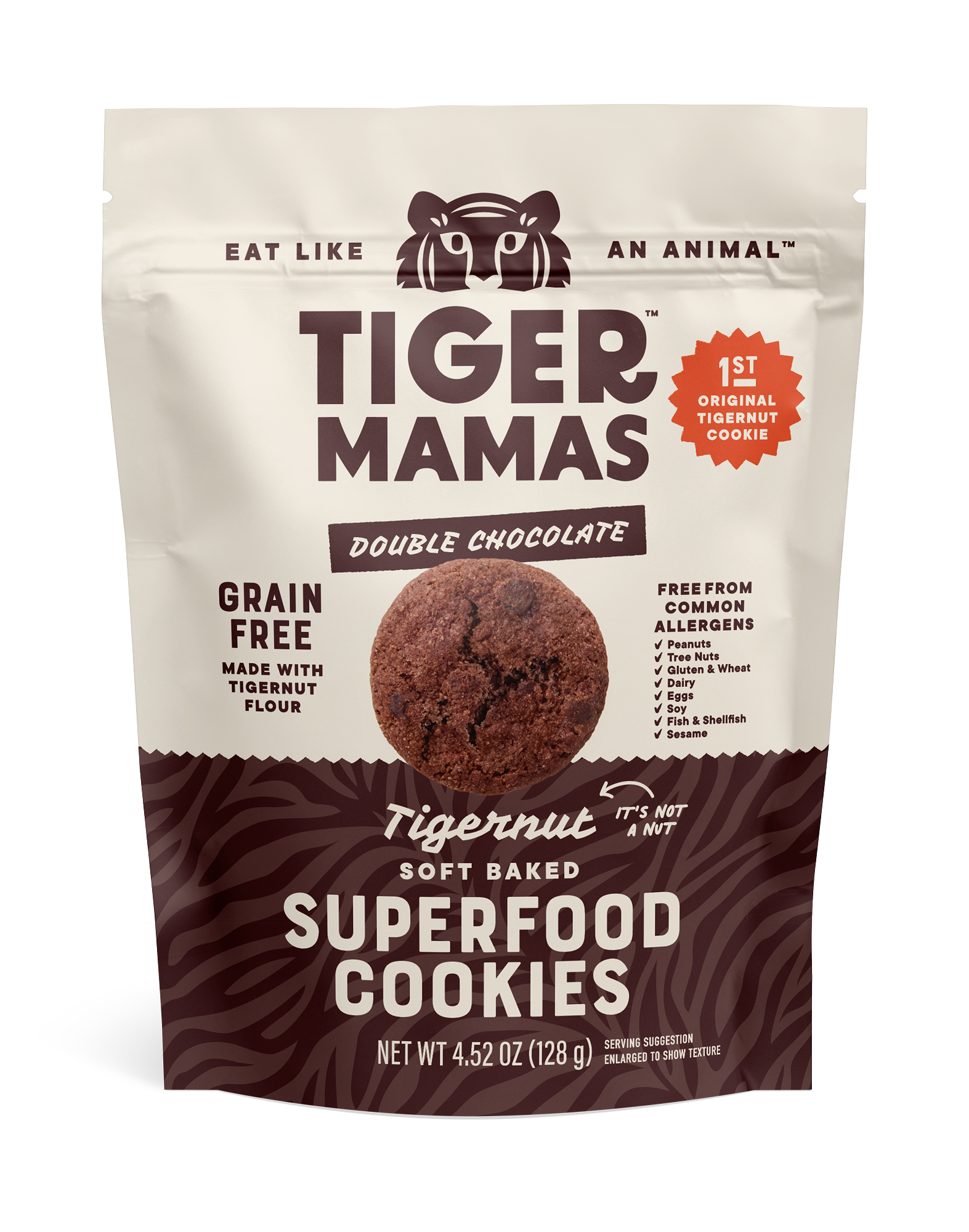
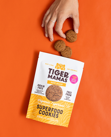
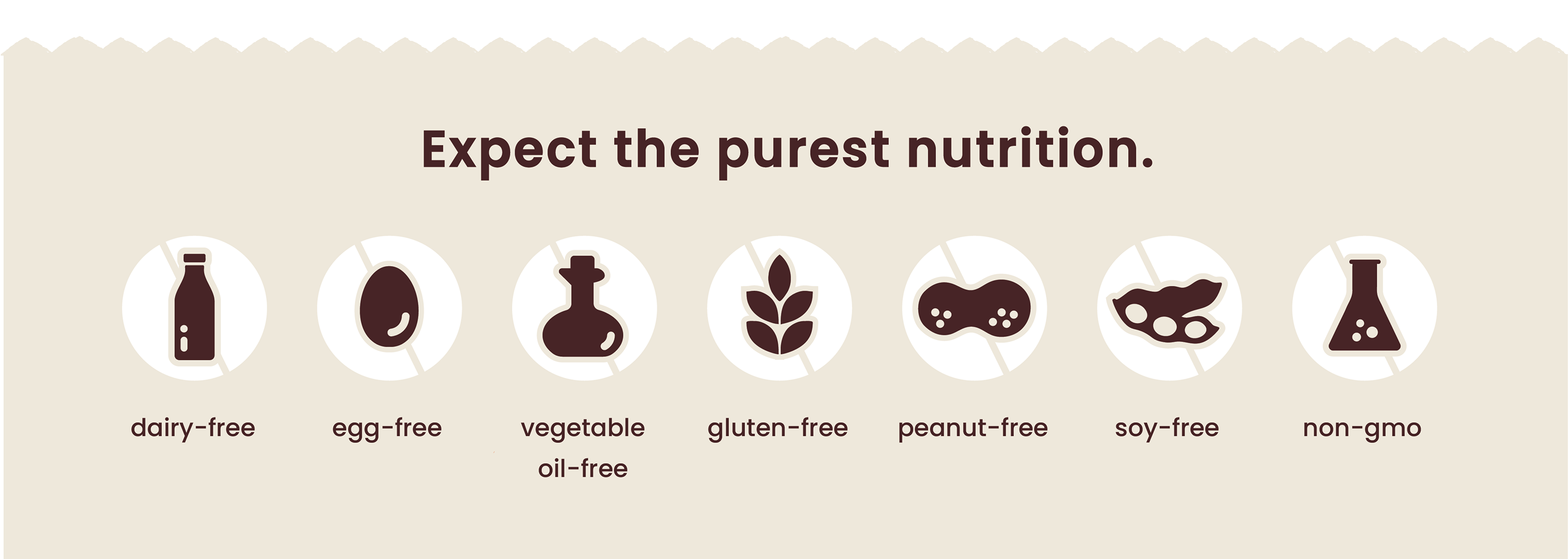
- Shout the safety credentials. Allergen-safe, gluten-free, clean ingredients—families needed to know at a glance that these cookies were school-safe.
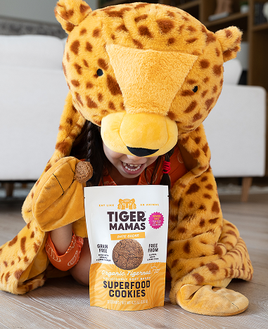
- Create a visual world. An illustrated tiger icon, jungle-patterned stripes, dynamic copy and typography that conveyed adventure and personality on shelf.
.png)
.png)

.png)

.png)
.png)

.png)
.png)
.png)
.png)


.png)

