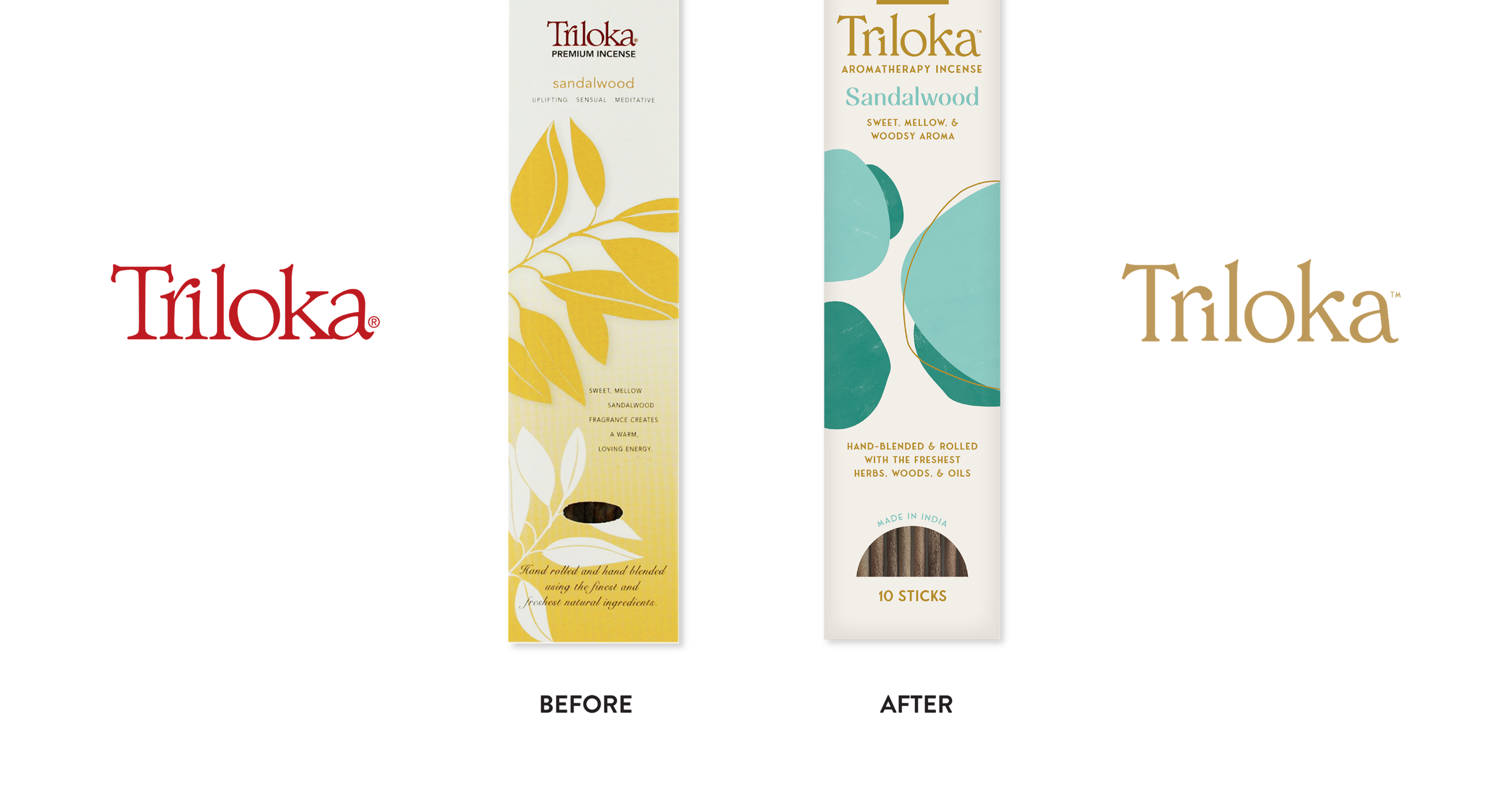
For over four decades, Triloka stayed true to handcrafted, high-quality aromatherapy incense made with time-honored techniques and sustainable sourcing. But retailers were pushing for more compliant packaging in the aromatherapy space, and Triloka saw an opportunity—not just to meet standards, but to refresh their original and premium lines around a new positioning: Smell Happy. The refresh landed so well that they brought us back for the rest of the brand experience.
Triloka was grappling with an outdated brand identity from the 80’s and a confusing brand architecture that limited its appeal and cohesiveness in the marketplace.
- Refresh the visual identity and packaging to meet modern retail standards and appeal to today's wellness-conscious shoppers—major partners like Whole Foods were demanding it.
- Clarify the brand architecture by bringing Triloka out from under Windrose Trading Company's shadow and establishing it as the hero brand.
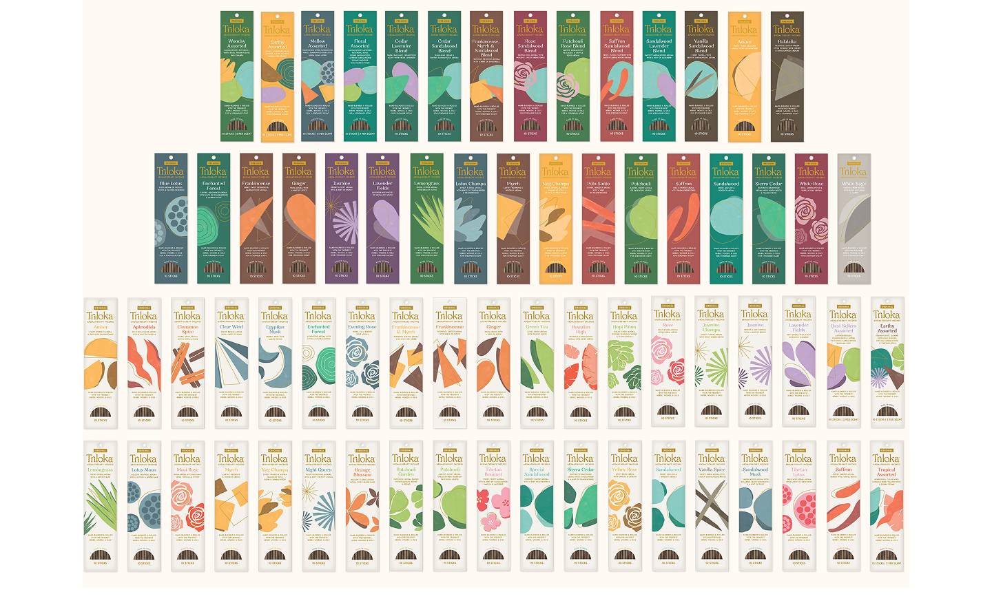
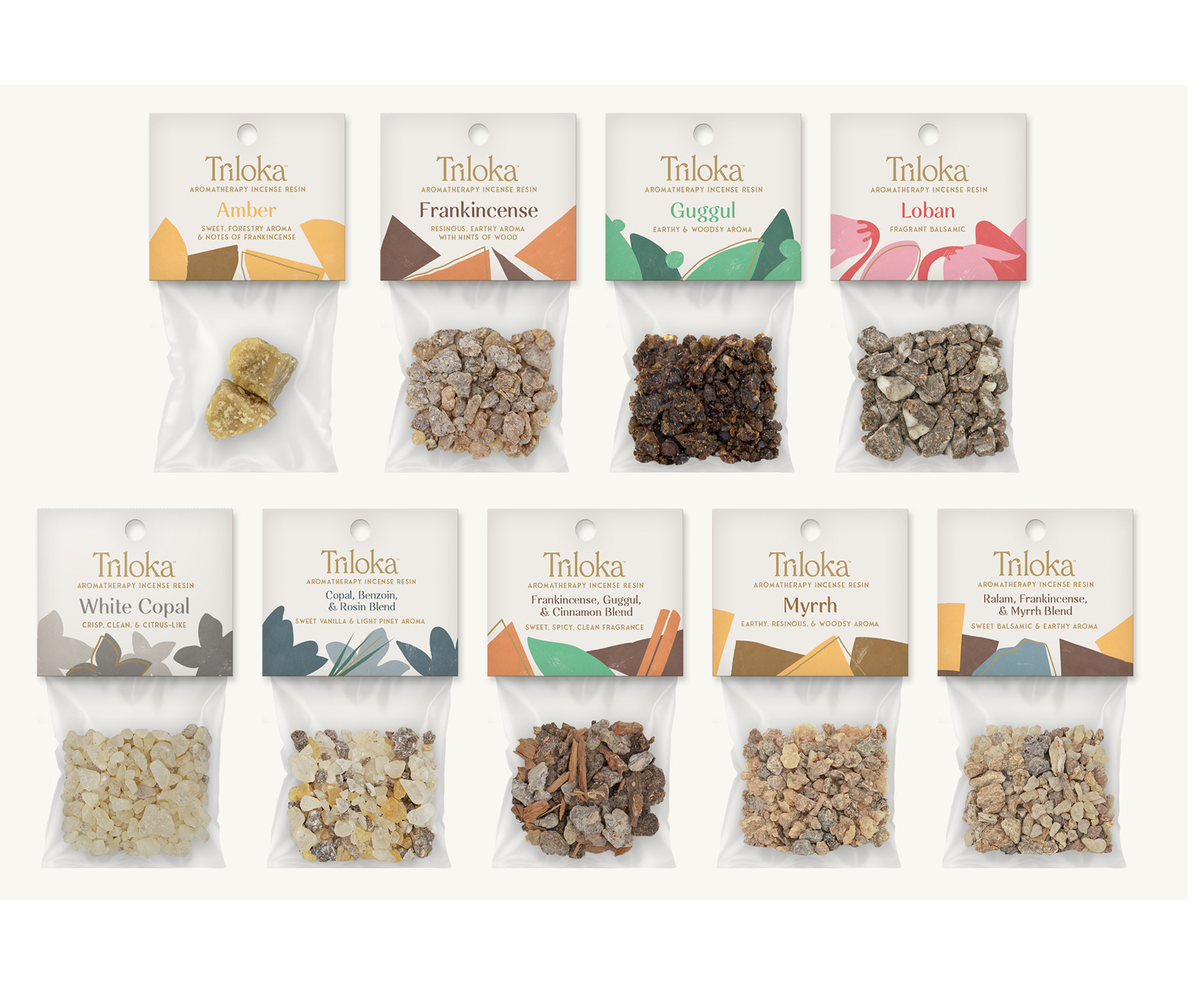
- Restructure the product catalog with clear hierarchy—defining core lines vs. extensions so retailers and consumers could navigate with confidence.
- Develop a unifying brand message and positioning that honor Triloka's spiritual, natural roots by providing more educational content on the beliefs and practices of aromatherapy.
- Create a tone of voice that captured the brand's essence while feeling lighter, more accessible, and relevant.

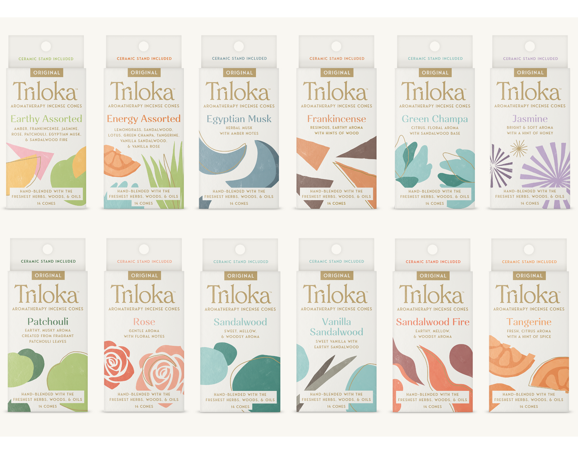
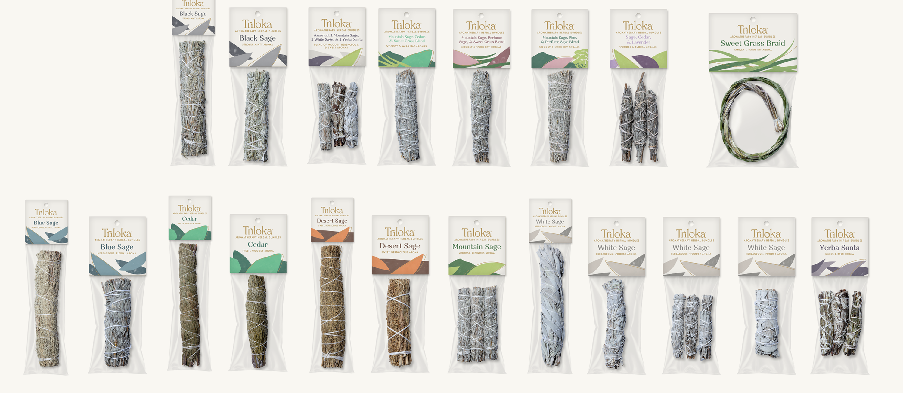
.png)
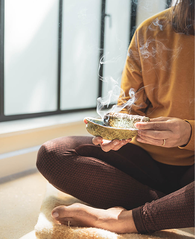
.png)
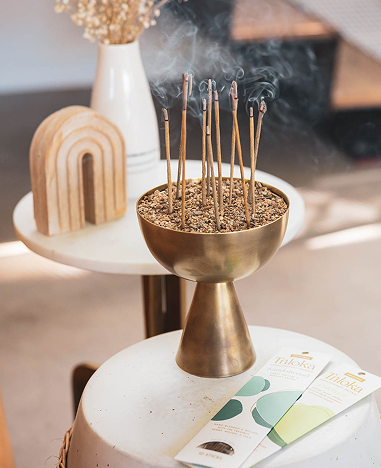
.png)
.png)


.png)

